How to Read Trading Charts
Updated: April 25, 2019
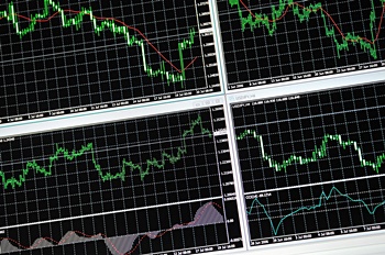
There are four types of trading charts that are commonly used by investors to understand movement in the stock market and other trading markets:
- Monthly Charts
- Weekly Charts
- Daily Charts
- Intraday Charts
The different types of trading charts illustrate a few ways price movement is expressed over a period of time. Looking at these types of trading charts can give investors an opportunity to analyze and understand price movement in a way that isn't possible without reviewing data from a chart. You will notice that your view of a particular stock or market can change drastically only by switching to a different time horizon. This article will explore the most common types of trading charts that are used to track movement in the markets.
Interpreting Trading Chart Data
Before you can use a stock market chart to plan a trade you have to understand what the data on the chart means. The top of the chart often displays helpful identification and price data points to assist the investor or trader in monitoring daily price and trading activity. These values are updated moment by moment throughout the day as new buy and sell orders enter the markets and old orders are filled or canceled.
Here’s an explanation of stock market chart data points as labeled on the chart.
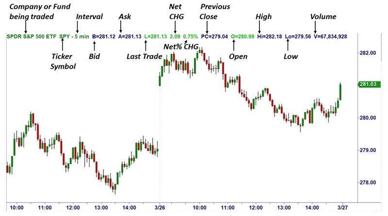
Chart for illustrative purposes only
- Company or Fund being traded – Indicates the particular company or fund whose price data is being shown.
- Ticker Symbol – Tells you the stock market ticker symbol of the company or fund whose price data is being shown.
- Interval – Charts can be viewed in a variety of timer intervals (e.g. 2 minute, 5 minute, daily, etc.). This indicates which interval the chart represents.
- Bid – Represented by a B at the top of the chart, this indicates the highest price at which someone is willing to buy this stock or fund.
- Ask – Represented by an A at the top of the chart, this indicates the lowest price at which someone is willing to sell this stock or fund.
- Last – Indicates the price of the Last trade placed.
- Net CHG - Indicates the difference in price between the Last trade and the price at close the previous trading day.
- Net % CHG – Because a $1 move in a $50 stock is more significant that a $1 move in a $200 stock, Net % Change more accurately represents the amount of price change for the stock or fund.
- Previous Close - Represented as PC on the top of the chart, this indicates the price of the stock at close the previous trading day.
- Open – Represented as O on the top of the chart, this indicates the price when the market opened that particular day.
- High – Represented as Hi on the top of the chart, this indicates the highest price the stock has traded at for the day.
- Low – Represented as Lo on the top of the chart, this indicates the lowest price the stock has traded at for the day.
- Volume – Represented as V on the top of the chart, this indicates the number of shares that are being traded throughout the session, offering a sense of how actively the stock is being traded relative to the most recent trading days.
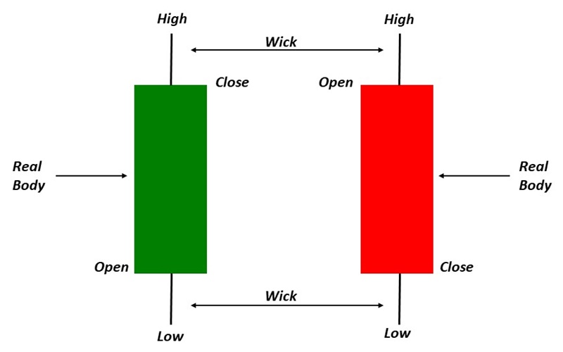
Bar charts with Candlesticks (so-called because they look like a candle of various heights with a wick extending from the top and/or bottom) are commonly used to show trading activity through various timeframes within the chart. The range is defined as the difference between the High (top of the wick, or candle if there is no wick) and Low (bottom of the wick, or candle if there is no wick). The top or bottom of the colored candle represent the price at open or close for the period being plotted.
With an understanding of the data provided on a stock market chart, you can then begin to learn what style of trading a monthly stock chart is used for vs. a weekly stock chart, etc.
Monthly Trading Charts
These are trading charts that illustrate the movement of price over a long-term horizon. Monthly charts are most often used by long-term
investors and will most often represent many years or even decades of price data for that particular security or market. Monthly
charts are not often used by most traders, because the time horizon it represents is not always applicable to popularly traded time
periods. This however, does not mean they are useless to all traders. In fact, a lot of the market’s "gems," or
representations of a particular era, are forever recorded on monthly charts. As a rule of thumb, these charts are commonly used to
analyze time periods in excess of four years.
The chart below illustrates the price action of XYZ over 2001 to 2009, expressed in monthly intervals. This means that each “bar” or
"candlestick" in the picture represents the opening, closing, high and low prices for each month in that time period:
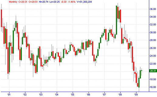 Monthly - 9 yr.
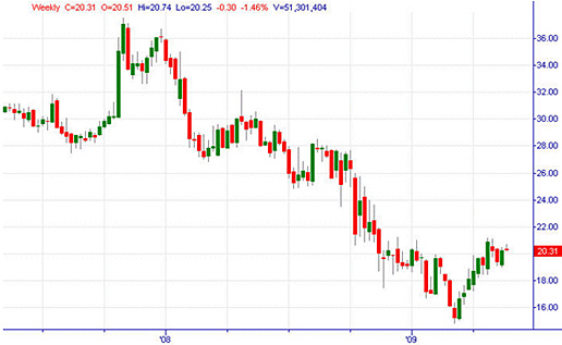
Weekly Trading Charts
Like the monthly trading charts, weekly charts are used by traders and investors who have a longer-term time horizon. However, weekly
charts come in quite handy to traders who are analyzing the intermediate-term time horizon as well. As a rule of thumb, weekly charts
are commonly used to analyze periods in excess of six months.
The chart below illustrates the price action of XYZ over years 2007 to 2009, in weekly intervals. Each "bar" or
"candlestick" represents the opening, closing, high and low prices for each week in that time period:
 Weekly - 2 yr.
Daily Trading Charts
Daily charts represent the price action of a market based on one-day intervals. Daily charts are perhaps the most commonly used
chart by traders and investors. These are handy in analyzing the short to intermediate-term time periods, however, many traders use
the daily charts for long-term analysis as well. As a rule of thumb, daily charts are commonly used to analyze periods in excess of
six weeks.
The chart below illustrates the price action of XYZ in early 2009, in daily intervals. Each "bar" or
"candlestick" represents the opening, closing, high and low prices for each day in that time period:
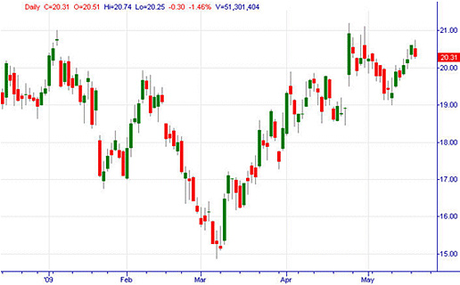 Daily - 6 mth.
Intraday Trading Charts
In addition to the Daily charts, Intraday charts are also extremely popular in the trading community. Intraday charts illustrate
the price movement of a market within the confines of the daily opening and closing bells of the markets.
While there are multitudes of ways we can look at intraday charts, the charts below are examples of commonly used intraday charts:
Intraday Hourly Charts
The chart below represents the price action of XYZ for a period of 25 trading days. Notice that the chart now includes more
detailed data produced within the confines of each trading day. Each "bar" or "candlestick" represents the
opening, closing, high and low of each one-hour interval for the time period. Hourly charts are commonly used for swing or short-term
types of trades that last from a few hours to several days:
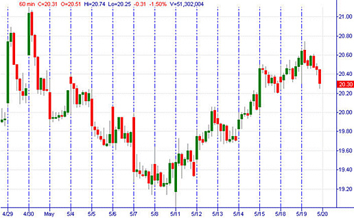 1 hr. - 3 weeks
Intraday 15-minute Charts
The chart below represents the price action of XYZ for a period of 4 trading days. Each "bar" or "candlestick"
represents the opening, closing, high and low of each 15-minute interval for the time period. 15-minute charts are commonly used for
day or swing-term types of trades that last from an hour to a few trading days:
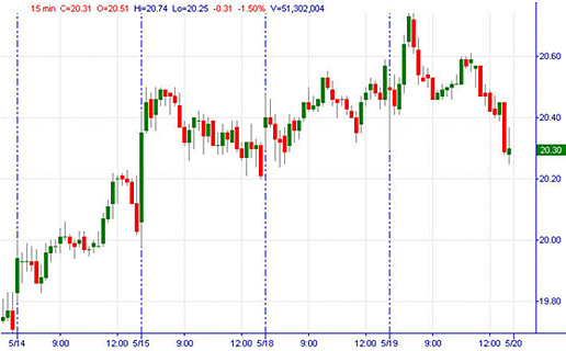 15 min. - 4 days
Intraday 5 Minute Charts
The Intraday 5-min chart is one of the most common day trading charts used by the trading community. The chart below represents the price
action of the S&P 500 for a period of 2 trading days. Each "bar" or "candlestick" represents the opening, closing, high and low of each
5 minute interval for the time period. 5-minute charts are commonly used for quick scalps or day trades that last from several minutes
to several trading hours. Also, the 5-minute chart is very popular for use by longer-term traders in selecting efficient entry and
exit points for longer-term trades:
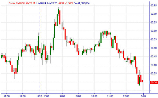 5 min. - Intraday
Intraday 2-minute Charts
The intraday 2-min chart is very popular among day traders. The chart below represents the price action of XYZ for a period of 3
trading hours. Each "bar" or "candlestick" represents the opening, closing, high and low of each 2-minute interval
for the time period. 2-minute charts are commonly used for scalping or day trades that last from several minutes to a few trading
hours:
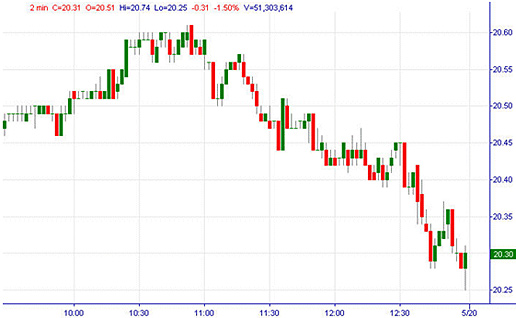 2 min. - Intraday
Intraday Tick/Trade Charts
Tick, or "trade" charts as they are sometimes known, are line charts that represent each trade the market executes. Time
is not an issue on tick charts. Each new "point" on the line is represented by an actual trade of the market. In illiquid
markets, the lack of trades will merely be represented by a flat line. In highly liquid markets, the tick chart is constantly on the
move, tracking each trade with a line across time, and up or down, to instantly represent increases and decreases in price. Tick
charts are often used by scalpers of the market, but are also used in regulation to track "out-of-the-money" trades that
otherwise need to be corrected. The chart below is an example of a tick chart:
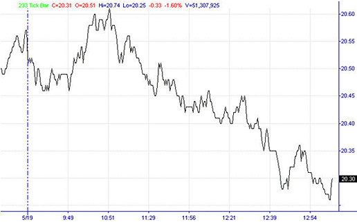 Tick Chart
As demonstrated above, a trader’s views of the market can dramatically change depending upon the time period he is analyzing. In
preparing to trade, the analysis of the correct time frame is crucial. For example, to analyze a monthly chart in order to scalp the
market does not make a lot of sense. Neither would it be prudent to take a long-term core position based on a tick or 5-minute chart.
Traders, investors and technical analysts tailor their expectations out of the market to suit a particular time frame analyzed.
Get Started with Your Financial Education
This content is intended to provide educational information only. This information should not be construed
as individual or customized legal, tax, financial or investment services. As each individual's situation
is unique, a qualified professional should be consulted before making legal, tax, financial and investment
decisions.
The educational information provided in this article does not comprise any course or a part of any course
that may be used as an educational credit for any certification purpose and will not prepare any User
to be accredited for any licenses in any industry and will not prepare any User to get a job. Past
results are not a guaranty of future performance.